jan 17, 2026
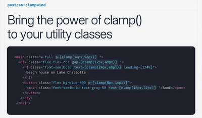
🔗 PostCSS Clampwind
In my previous post, Generate fluid styles with a Tailwind plugin I explored generating fluid styles with a Tailwind v3 plugin. The approach worked, but had significant downsides: massive CSS output, fragile selectors, and limited flexibility. After Tailwind v4 came out, I decided to take a completely different approach.
# The idea
Instead of trying to make Tailwind do all the heavy lifting with custom variants and CSS variables, what if we let Tailwind generate the CSS as it normally would, and then transform the output with PostCSS?
The key insight is that Tailwind v4 already provides everything we need:
- Breakpoint variants with the
md:max-lg:syntax define the screen range - Arbitrary values with
text-[clamp(16px,50px)]can express the value range
PostCSS can read both and calculate the fluid formula, this means minimal transformations plugin-side, and leveraging what Tailwind already does well.
# How Tailwind v4 handles breakpoints
Looking at how Tailwind generates CSS for a ranged breakpoint utility:
<div class="md:max-lg:text-[24px]">
</div>
Generates the following CSS
.md\:max-lg\:text-\[24px\] {
  @media (width >= 48rem) { /* 768px */
    @media (width < 64rem) { /* 1024px */
      font-size: 24px;
    }
  }
}
The nested media queries give us exactly what we need: the min and max screen sizes for the interpolation. Plus:
- Modern range syntax
- Converts everything to rem
- Generates custom breakpoints too
<div class="min-[700px]:max-[800px]:text-[24px]">
</div>
# Keeping the clamp() function name
Writing a non-valid clamp() still informs Tailwind that I'm using a size property. I first tried a shorter syntax:
<div class="text-[cl(16px,50px)]">
</div>
But this makes Tailwind generate the wrong property:
.text-\[cl\(24px\)\] {
  color: cl(16px,50px); /* Text color */
}
Using the actual clamp() function name works better
<div class="text-[clamp(16px,50px)]">
</div>
- Right CSS property
- Tailwind handles whitespaces
- I just need to read the values inside the parenthesis, convert everything to rems and write out the formula
.text-\[clamp\(16px\,50px\)\] {
  font-size: clamp(16px,50px);
}
This two-value clamp() is invalid CSS, but the PostCSS plugin will transform it into the valid three-value version.
The PostCSS plugins work by walking through the CSS AST (Abstract Syntax Tree) and transforming nodes. The plugin needs to:
- Find all declarations containing two-value
clamp()calls - Extract the min and max values
- Find the parent media queries to determine the screen range
- Calculate the fluid formula
- Replace the declaration with the valid clamp
 See the PostCSS plugin in action at clampwind.dev
# How to use it
To use this plugin you need to use the clamp() function but with only two arguments, the first one is the minimum value and the second one is the maximum value.
# Clamp between smallest and largest breakpoint
Write the Tailwind utility you want to make fluid, without any breakpoint modifier, for example:
<div class="text-[clamp(16px,50px)]"></div>
This will use Tailwind default largest and smallest breakpoint.
.text-\[clamp\(16px\,50px\)\] {
  font-size: clamp(1rem, calc(...) , 3.125rem);
}
# Clamp between two breakpoints
Simply add regular Tailwind breakpoint modifiers to the utility, for example:
<div class="md:max-lg:text-[clamp(16px,50px)]"></div>
To clamp the CSS property between the two breakpoints you need to use the max- modifier, in this case the CSS property will be clamped between the md and lg breakpoints.
This will generate the following css:
.md\:max-lg\:text-\[clamp\(16px\,50px\)\] {
  @media (width >= 48rem) { /* >= 768px */
    @media (width < 64rem) { /* < 1024px */
      font-size: clamp(1rem, calc(...), 3.125rem);
    }
  }
}
# Clamp from one breakpoint
If you want to define a clamp value from a single breakpoint, postcss-clampwind will automatically generate the calculation from the defined breakpoint to the smallest or largest breakpoint depending on the direction, for example:
<div class="md:text-[clamp(16px,50px)]"></div>
This will generate the following css:
.md\:text-\[clamp\(16px\,50px\)\] {
    @media (width >= 48rem) {  /* >= 768px */
      font-size: clamp(1rem, calc(...), 3.125rem);
    }
  }
Or if you use the max- modifier:
.max-md\:text-\[clamp\(16px\,50px\)\] {
    @media (width < 48rem) { /* < 768px */
      font-size: clamp(1rem, calc(...), 3.125rem);
    }
  }
# Clamp between custom breakpoints
With Tailwind v4 it's really easy to use one-time custom breakpoints, and this plugin will automatically detect them and use them to clamp the CSS property.
<div class="min-[1000px]:max-xl:text-[clamp(16px,50px)]"></div>
This will generate the following css:
.min-\[1000px\]\:max-xl\:text-\[clamp\(16px\,50px\)\] {
  @media (width >= 1000px) { /* >= 1000px */
    @media (width < 64rem) { /* < 1600px */
      font-size: clamp(1rem, calc(...), 3.125rem);
    }
  }
}
# Clamp between Tailwind spacing scale values
A quick way to define two clamped values is to use the Tailwind spacing scale values, for example:
<div class="text-[clamp(16,50)]"></div>
The bare values size depends on the theme --spacing size, so if you have have it set to 1px it will generate the following css:
.text-\[clamp\(16\,50\)\] {
  font-size: clamp(1rem, calc(...), 3.125rem);
}
# Clamp custom properties values
You can also use custom properties in your clamped values, for example like this:
<div class="text-[clamp(var(--text-sm),50px)]"></div>
or like this:
<div class="text-[clamp(--text-sm,--text-lg)]"></div>
But this won't work when using two custom properties directly in the CSS with @apply, so you need to use the var() function instead.
.h2 {
  @apply text-[clamp(var(--text-sm),var(--text-lg))];
}
# Clamp container queries
Postcss-clampwind supports container queries, just by using the normal Tailwind container query syntax, for example:
<div class="@md:text-[clamp(16px,50px)]"></div>
This will generate the following css:
.@md\:text-\[clamp\(16px\,50px\)\] {
  @container (width >= 28rem) { /* >= 448px */
    font-size: clamp(1rem, calc(...), 3.125rem);
  }
}
# Configuration
Tailwind v4 introduced the new CSS-based configuration and postcss-clampwind embraces it.
# Add custom breakpoints
To add new breakpoints in Tailwind v4 you normally define them inside the @theme directive.
But Tailwind by default, will not output in your CSS any custom properties that are not referenced in your CSS, for this reason you should use the @theme static directive instead of @theme to create custom breakpoints.
@theme static {
  --breakpoint-4xl: 1600px;
}
# Set a default clamp range
You can set a default clamp range to use when no breakpoint modifier is used, like this:
<div class="text-[clamp(16px,50px)]"></div>
To set a default clamp range you need to use the --breakpoint-clamp-min and --breakpoint-clamp-max custom properties, defined inside the @theme static directive.
@theme static {
  --breakpoint-clamp-min: 600px;
  --breakpoint-clamp-max: 1200px;
}
This will also apply for utilities that use only one breakpoint modifier. In this example the md breakpoint will be used as the minimum breakpoint, and --breakpoint-clamp-max will be used as the maximum breakpoint:
<div class="md:text-[clamp(16px,50px)]"></div>
The default clamp range will let you to simplify your utilities, since usually you don't need to clamp between the smallest and largest Tailwind breakpoints, but only between two breakpoints.
You will still be able to clamp between any other Tailwind or custom breakpoints, even if out of the default clamp range.
# Use custom properties
You can use any custom properties in your clamped values, for example:
<div class="text-[clamp(--custom-value,50px)]"></div>
You just need to make sure that the custom property is defined in your :root selector.
:root {
  --custom-value: 16px;
}
# Pixel to rem conversion
If you are using pixel values in your clamped values, clampwind will automatically convert them to rem. For the conversion it scans your generated css and if you have set pixel values for the root font-size or for your --text-base custom property in your :root selector, it will use that value to convert the pixel values to rem values. If you haven't set a font-size in your :root selector, it will use the default value of 16px.
:root {
  font-size: 18px; /* 18px = 1.125rem */
}
or like this:
:root {
  --text-base: 18px; /* 18px = 1.125rem */
}